Shwin
Role: Solo UI/UX Designer
Platform: Windows app, iPad app
Tools: Figma, Photoshop
Highlights: UI/UX Design, Interaction Design, Design System, Visual Design
shwin is an all-in-one app for musicians to move sheet music from their desktop to their iPad and read it right there, on-device. It replaces the usual workarounds, like transfer apps or cloud storage, with one simple flow: drag in a file, pick a nearby iPad, and start playing.
This case study covers the design: why existing tools fall short for musicians, how the interaction was structured around steps people already understand, and how the interface moved from initial wireframes to a final visual design in Figma.
Project Overview:

The Problem
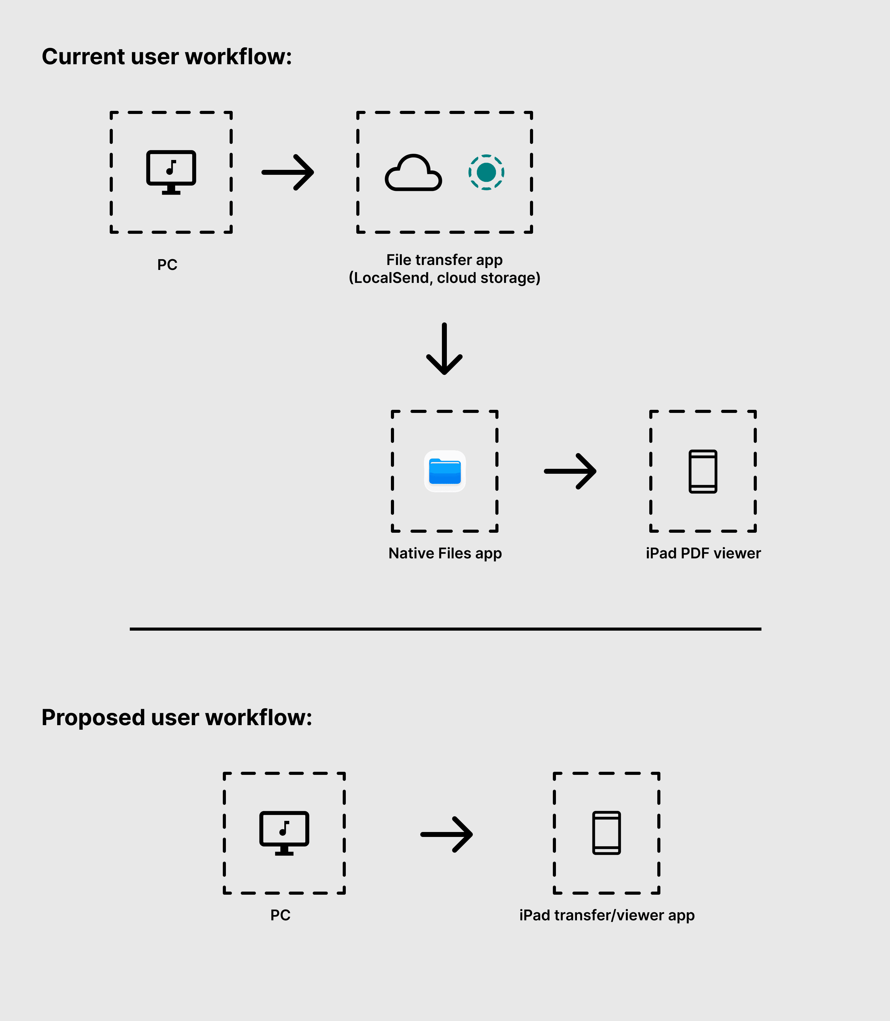
Getting a score onto an iPad usually takes three apps:
A file-transfer app (such as LocalSend) or cloud storage to move the PDF
The Files app to find it
A separate PDF reader to actually play from it
The opportunity: one app that moves the file and opens it, so the score is ready to play the moment it arrives.
Goals
shwin has one job: get scores onto an iPad as quickly as possible. Three goals shaped the design.
1. Easy to use at first glance.
Someone opening shwin for the first time should know what to do without instructions. No tutorial, no learning curve.
2. No folders, no cloud storage.
Moving a score shouldn't mean creating a folder, uploading to a cloud drive, or syncing and waiting. Drag a file in, pick an iPad, and send. There's nothing to set up or organize first.
3. Lightweight.
A tool you use for one quick task shouldn't feel like software. shwin should be small and fast to open, and just as light visually: a simple, uncluttered interface with nothing extra to get through.
Ideation and Wireframes
Starting top to bottom.
The first wireframe stacked everything vertically: a "Files" box on top, an arrow pointing down, and a "Nearby Devices" box below it. It was a clear idea, but it got cramped quickly.
Switching to a side-by-side layout meant the panels and windows could grow as more files were added, and the screen simply looked better balanced. The arrow now points from files to device, the way you'd read it.

The flow in six screens.
The whole experience comes down to six screens: start, add files, choose a device, send, done, and reset for the next batch. Each one builds on the last, with the same two panels and the same button in the same place.

Visual Design
Exploring the drag-and-drop area.
The first screen is the first impression, so I tested three treatments for the drop area: a dashed outline on its own, a solid panel on its own, and the two combined. The combined version won: the solid panel gives the area weight, and the dashed outline around it signals "drop files here." Here I was also experimenting with a dark color scheme for the app.

Finding the colors.
I also built the same screen in a light theme and a dark theme before choosing dark. The final system is based around a cool dark blue color scheme, with panels and buttons in varying shades of blue depending on priority and visual hierarchy. The interactable elements were also built as variants in Figma, to facilitate easy prototyping.

Progress test.
I tested three ways to show progress on the sending button: a lighter fill sweeping across it (as in the original wireframe), diagonal stripes, and an outline that grows around its edge.

I decided to pick the third design, as the first two implied more of a "Loading" state vs a "Sending" state. This version contains an outline that starts at the left edge of the button, splits into two arcs that travel around it, and meets at the right edge. When the last file lands, the ring closes into the full border, then disappears, leaving the button ready for the next send.
Outcome and Reflection
The outcome.
The result is a six-screen desktop flow built from one small set of reusable pieces: a panel, a list row, a handful of icons, and a single button with updating states. This design in Figma is also responsive, and contains a design library based on components and tokens. Paired with a native iPad companion app, this will eliminate the need for multiple

What I took away.
Small details take the most iteration. Building a design that not only looked right, but created a pleasing user experience and was also built to modern standards in Figma was a challenge I was pleased to take on.
What's next.
The desktop sender is designed. Next up is the iPad companion app, where I'm working through:
A score library with list and thumbnail views, plus sort, search and filter
A PDF viewer with tailor-made controls for simple music viewing